Your home is more than just a place to live. It’s a space that can shape your mood, productivity, and overall well-being. The colors you choose for your walls, furniture, and decor influence how you feel every single day.
Whether you want to feel more energized, create a stress-free retreat, or boost creativity, understanding color psychology can help you design a home that works with your emotions, not against them.
Forget the outdated rule that you should only use neutrals to create a calm space.
This guide will show you how to use color strategically, from subtle shifts in your decor to bold statements that enhance the atmosphere of each room.
1. Use soft blues for instant stress relief
Ever wonder why spas and luxury hotels often use shades of blue? It’s because blue tones are scientifically proven to reduce stress and lower blood pressure. A soft sky blue or powdery periwinkle on walls or bedding can make a bedroom or bathroom feel like a retreat from the world.
why you will love it:
- calms the nervous system and promotes relaxation
- makes small spaces feel bigger and more open
- pairs beautifully with white and natural wood for a breezy aesthetic
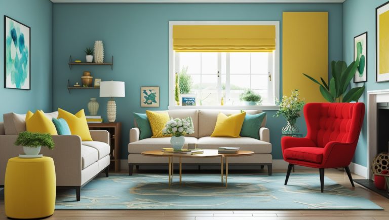
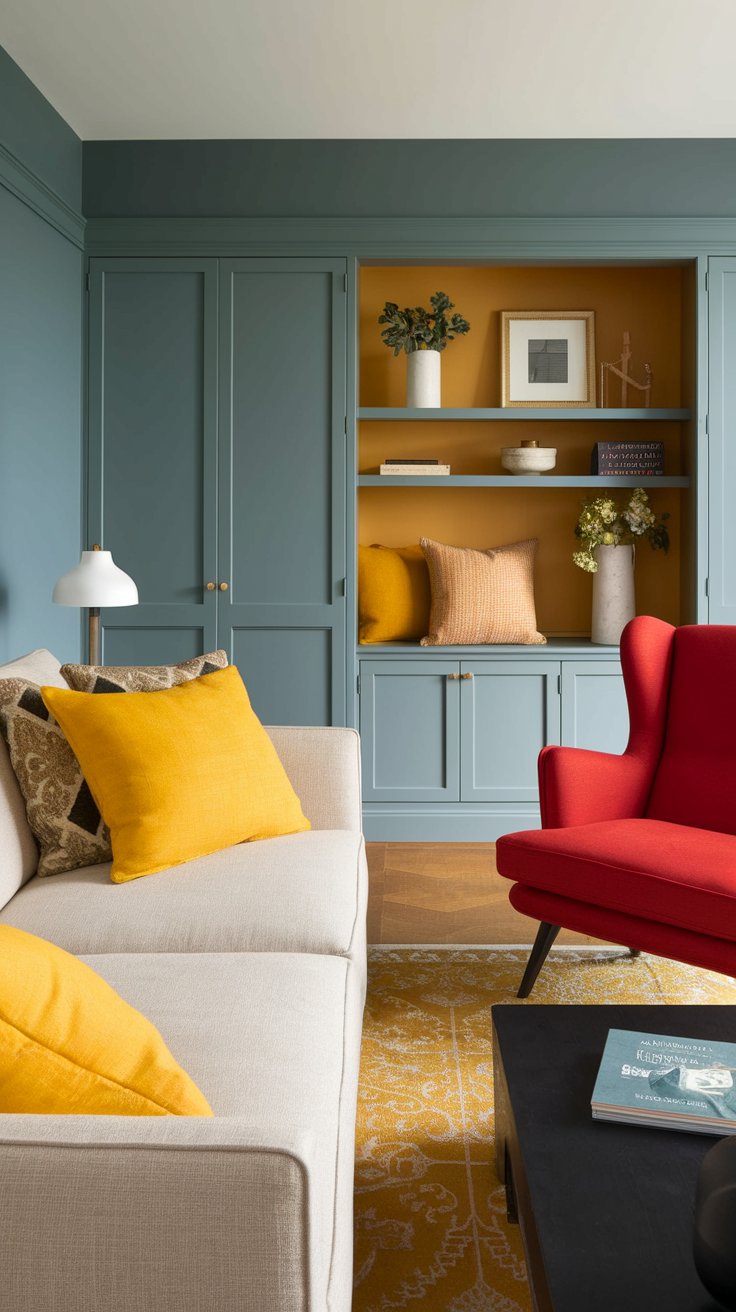
2. Energize your space with pops of yellow
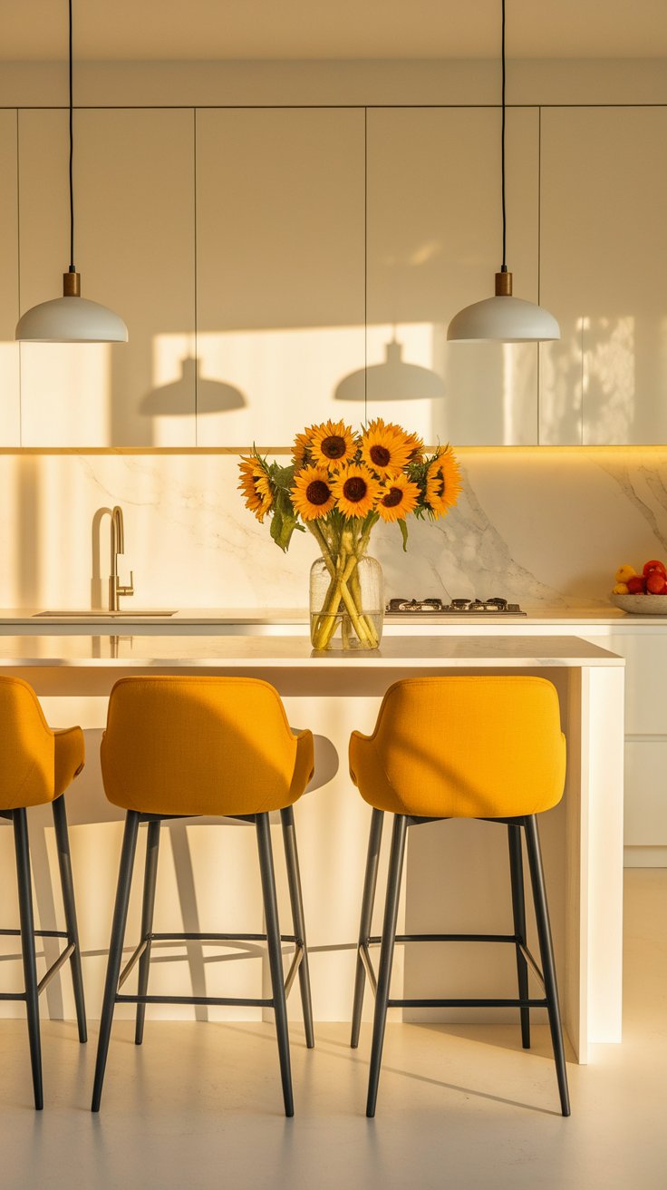
Yellow is like sunshine in a room—it boosts happiness, encourages creativity, and makes spaces feel brighter. But go too bold, and it can feel overwhelming. Instead of painting a whole room yellow, try mustard or golden-hued decor like pillows, chairs, or art in a kitchen, dining room, or home office.
why you will love it:
- boosts motivation and creativity
- adds warmth to neutral spaces
- works well with deep greens and charcoal tones for a trendy look
3. Use deep green to create a grounded, peaceful atmosphere
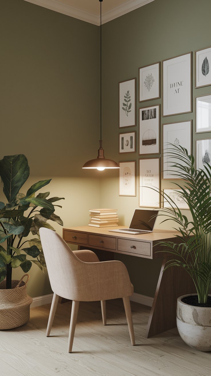
Green is the color of balance, renewal, and nature, making it perfect for creating a stress-free living room or office. Instead of painting an entire room dark green, try deep olive or muted sage tones on furniture, throw pillows, or accent walls. If you want an even subtler touch, introduce plants for a natural dose of green.
why you will love it:
- enhances relaxation and focus
- brings an organic, earthy vibe indoors
- pairs well with neutrals, terracotta, and warm woods
4. Add warmth and sophistication with earthy neutrals
Neutral colors don’t have to be boring. Instead of plain beige, opt for warm taupes, creamy off-whites, or clay tones to make your home feel cozy and timeless. These tones work beautifully in living rooms and bedrooms to create a calm, welcoming space without feeling flat.
why you will love it:
- makes rooms feel effortlessly stylish
- works with any decor style, from rustic to modern
- allows texture and lighting to shine
5. Use red sparingly to increase energy and confidence
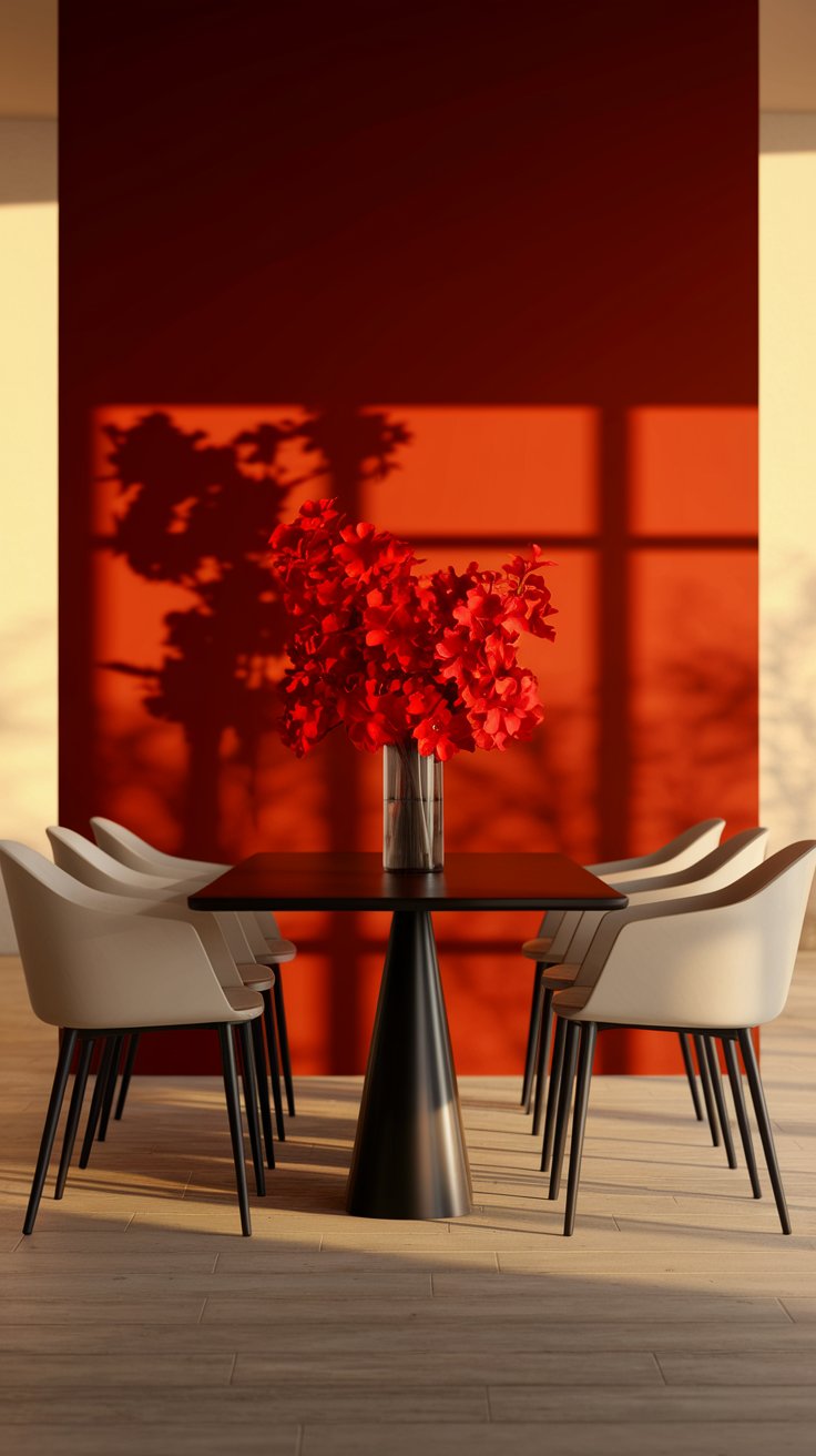
Red is bold, fiery, and intense—which is why you should use it strategically. It’s great for dining rooms, workout spaces, and kitchens, where it can increase appetite and motivation. Instead of painting an entire room red, add small elements like a statement chair, a patterned rug, or bold artwork to give a space instant energy.
why you will love it:
- makes a powerful statement without overpowering the room
- increases energy and enthusiasm
- pairs well with deep grays and metallic accents for a luxe look
6. Bring serenity into your bedroom with lavender and dusty lilac
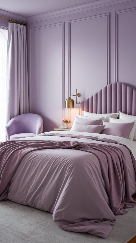
If you want a bedroom that feels like a sanctuary, soft purple hues like lavender or dusty lilac are perfect. These shades have a soothing, meditative quality and pair beautifully with light neutrals. Try incorporating these tones into bed linens, curtains, or accent walls for a dreamy, peaceful vibe.
why you will love it:
- promotes relaxation and better sleep
- adds softness without feeling overly feminine
- pairs beautifully with muted greens and warm whites
7. Use charcoal gray for a sophisticated, high-focus office
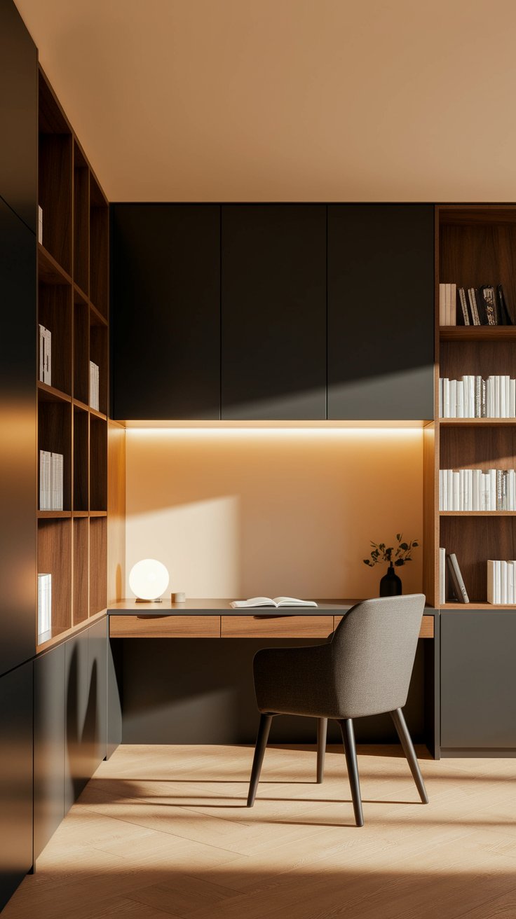
Gray gets a bad reputation for being dull, but when used the right way, it creates a sleek, modern look that enhances concentration. A deep charcoal gray works especially well in home offices or reading nooks, where it provides a sense of depth and focus without distractions. Add warm wood tones and greenery to keep the space from feeling too cold.
why you will love it:
- helps reduce distractions and improve focus
- gives a modern, luxurious feel
- works well with soft whites and warm metallics
8. Add soft peach or coral for a welcoming, uplifting vibe
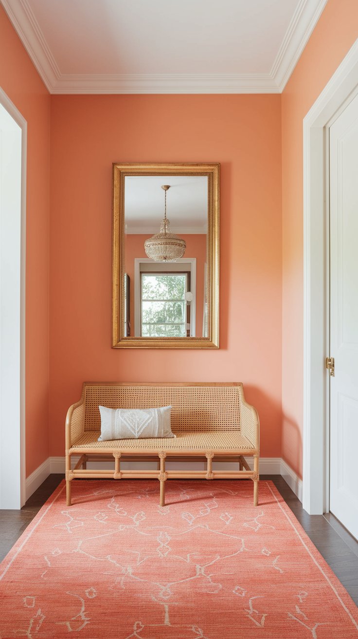
Peach and coral bring warmth and playfulness to a space, making them perfect for entryways, creative studios, or children’s rooms. These tones feel welcoming but not overwhelming, helping to create a space that feels friendly and inviting.
why you will love it:
- makes spaces feel brighter and more cheerful
- blends well with neutral palettes for a soft contrast
- brings out natural sunlight in a room
9. Use jewel tones for a dramatic, moody feel
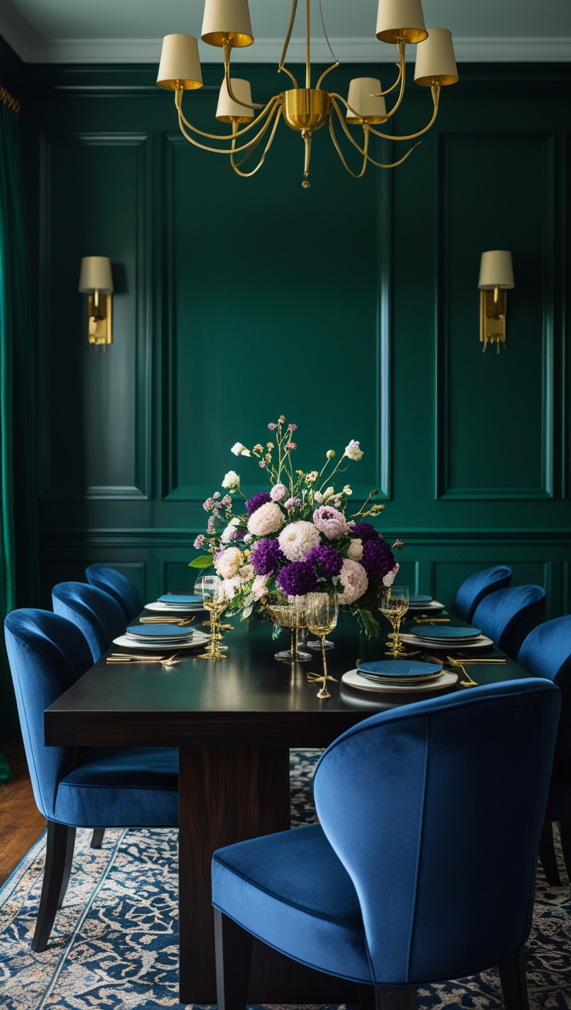
Deep emerald green, sapphire blue, and rich plum bring luxury and depth into a space. These colors are great for formal dining rooms, home libraries, or accent walls, where they create a moody, elegant atmosphere. To keep the space from feeling too dark, add warm lighting and rich textures like velvet and gold accents.
why you will love it:
- adds drama and sophistication
- makes a room feel intentionally designed
- pairs beautifully with metallics and dark wood
10. Incorporate black for contrast and depth
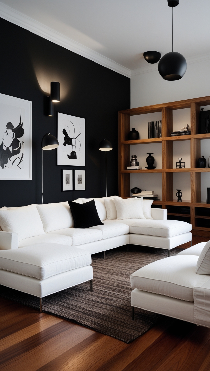
Black isn’t just for modern interiors—it’s a great way to anchor a space and make other colors pop. Instead of overwhelming a room with too much black, use it in lighting fixtures, furniture frames, or accent walls to add contrast and depth to a lighter color scheme.
why you will love it:
- makes neutral rooms feel more structured
- creates a dramatic and modern feel
- pairs well with bold accent colors and warm metallics
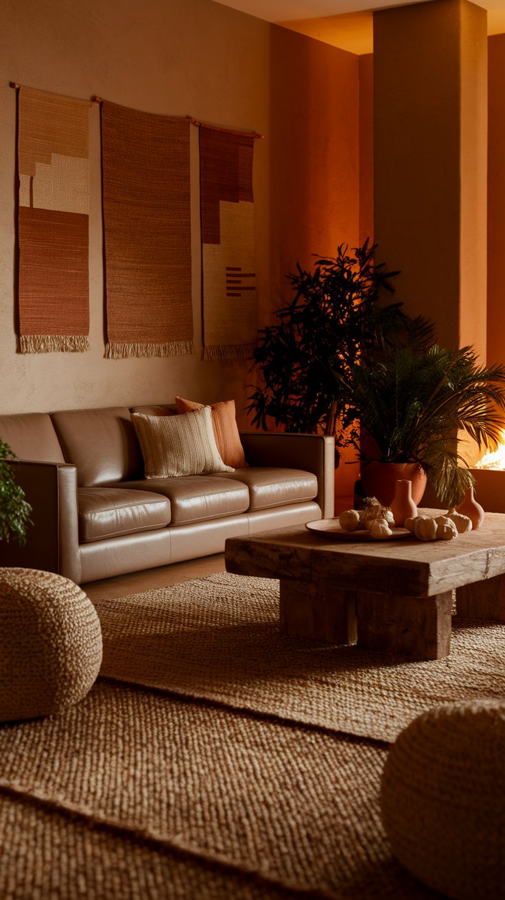
11. Bring warmth and comfort with terracotta and clay tones
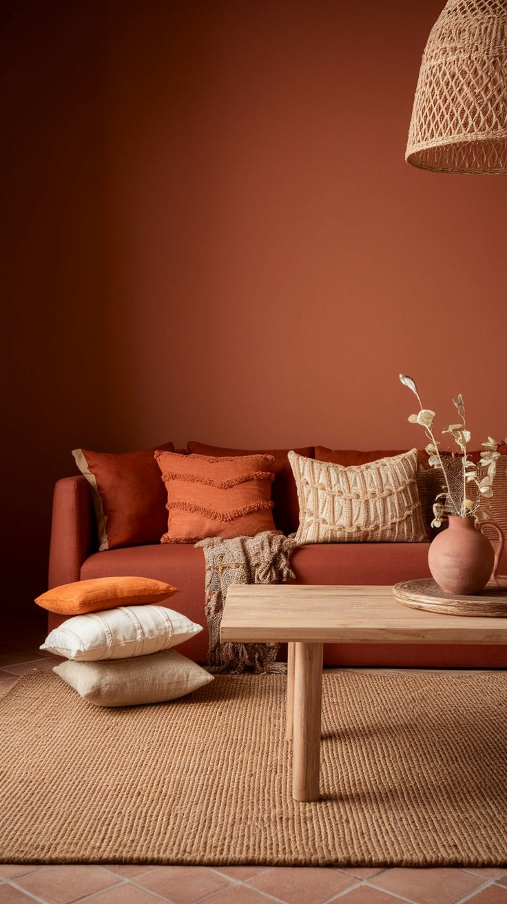
Terracotta and clay tones instantly add warmth and a natural, earthy feel to a space. These colors are perfect for bohemian, rustic, or Mediterranean-inspired decor, creating a cozy, sun-kissed atmosphere. Try terracotta throw pillows, ceramics, or textured wall paint for a lived-in, welcoming look.
why you will love it:
- adds warmth without feeling overpowering
- works beautifully with plants and natural textures
- gives a home a timeless, well-traveled aesthetic
Color psychology isn’t just about aesthetics—it’s about designing a home that makes you feel good every day. Whether you want to feel more relaxed, focused, or energized, these color tricks will help you curate a space that supports your mood and lifestyle.
Which color are you excited to incorporate into your home first?
Related Articles: